Bounce - Usability Review
User Testing Defines Design Approach
Tools: Heuristic Analysis, Usability Review, Remote and in Lab User Testing, Research Synthesis, Findings and Recommendations Report, Interactive Prototyping
A comprehensive usability review and evaluation to determine of Bounce. A site that connects aspiring musicians to musical professionals and facilitates feedback of original music. Key opportunities for overall improvement and usability were identified and the current interface does not support the primary goals of the site. Findings from usability review and confirmed with user testing directed design recommendations made to the client.
Bounce Site Goals:
Connect aspiring musicians to musical professionals
Enable musical professionals to teach career skills to aspiring musicians
Facilitate the provision of feedback and critique between musicians (e.g. singers, songwriters, and instrumentalists)
To begin, our team performed a heuristic analysis using Schniederman’s Criteria for User Interface Design in order to identify pain-points and usability challenges. This evaluation defined goals for our usability testing.
Usability Evaluation Goals:
- Investigate the Navigation and Orientation of the site
- Ensure the mental model meets the interaction model
- Evaluate the prices that connects bounce members
- Discover opportunities in the communication systems (feedback and messaging) within the Bounce Web Application
Testing Scenarios
Connecting with a Friend
You have an account on this site. Your username is __________.
Can you show me how you would expect to add another member to Bounce?
Setting/Changing up your profile
A friend has sent you an invite to join this website, after accepting their e-mail invite you’re sent to your newly created profile. Will you please update your profile to better reflect who you are.
-You’ve been using Bounce for a while and have discovered that you’re really into folk music, please update your profile to reflect this.
Receiving Feedback
You’ve uploaded a song a few days ago and want to check it to see if anyone has given
you feedback, would you walk me through how you would do that?
Can you tell me what you’d expect the action of these icons to perform?
Messaging another Member or Mentor
Could you show me how you would get in touch with a fellow user through the site and send that user a message?
Full-text testing script : https://drive.google.com/drive/folders/1iqgKSn-8QHlnF2dZWzy_9Gzaeq7tdQio
Usability Testing:
A script was written that would be used for testing. Users were presented with task based scenarios that would allow the participant to engage with the site in a realistic way. Our team performed both remote and in-lab testing. From here, participant data was compiled together. The data was sorted, synthesized, and organized. The key usability issues were identified and then ranked according to their severity level affecting the usability of the web application.
Key Usability Issues:
- Navigation and Orientation
- Mismatch between user mental model and the multiple components of the interaction model
- Inconsistencies in language and graphic elements
- Information presented to user is not clear and causing confusion
Design Recommendations:
User testing and usability evaluation methods revealed that navigation and consistency were major usability catastrophes. Organizing the sites content and navigation was the greatest redesign challenge. I began in my sketchbook exploring way to organize the content of the site and develop a sense of consistency in order to align the interaction model with the users mental model. Once the information was organized, unnecessary information and graphics were removed that did not support the Bounce Site Goals
Prototyping:
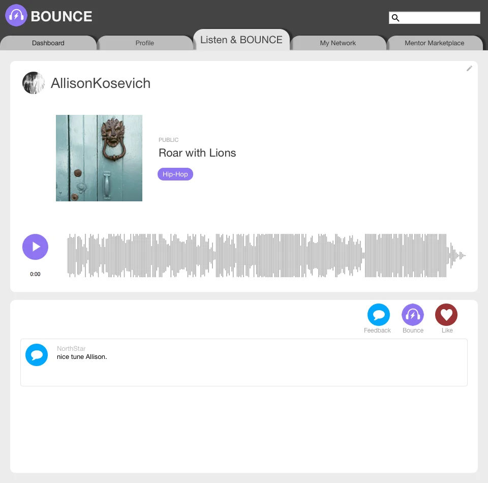
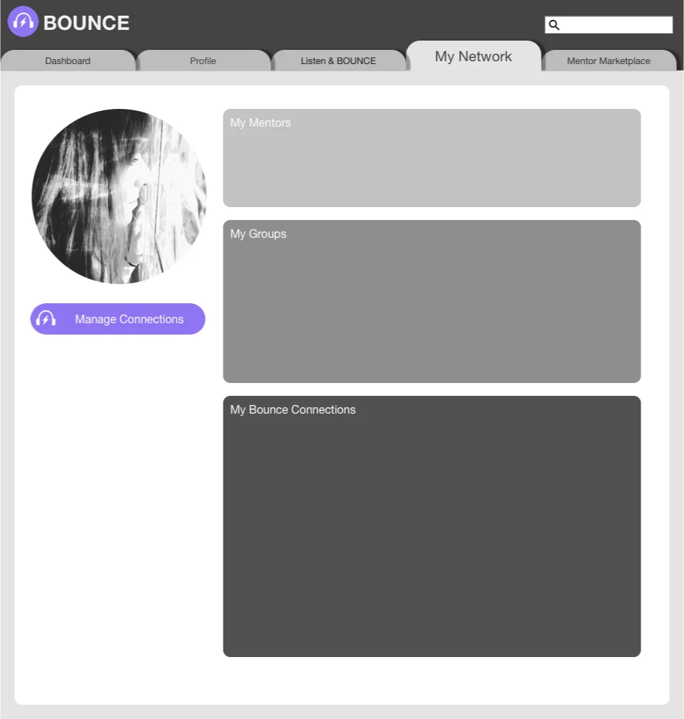
This prototype demonstrates the recommendations for usability improvements.
The content has been restructured to simplify the user task flow and the new navigation system will solve user confusion with orientation in the site. A reduced and simplified system of icons was created and their functions are consistent throughout the entire interface. Member hierarchy and connection have been clarified and simplified with the My Network page.
The design recommendations will help Bounce support it’s users in meeting their goals that are currently very difficult to accomplish.The simple style and aesthetics have remained very similar to the original site as users expressed delight over the clean and simple interface.


